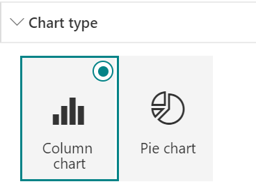
Just recently updated Quick chart web part on SharePoint Online introduced a feature to display data from a list on SharePoint. This adds possibilities and simplifies the usage of the web part. Currently there is two chart types available: column chart and pie chart.
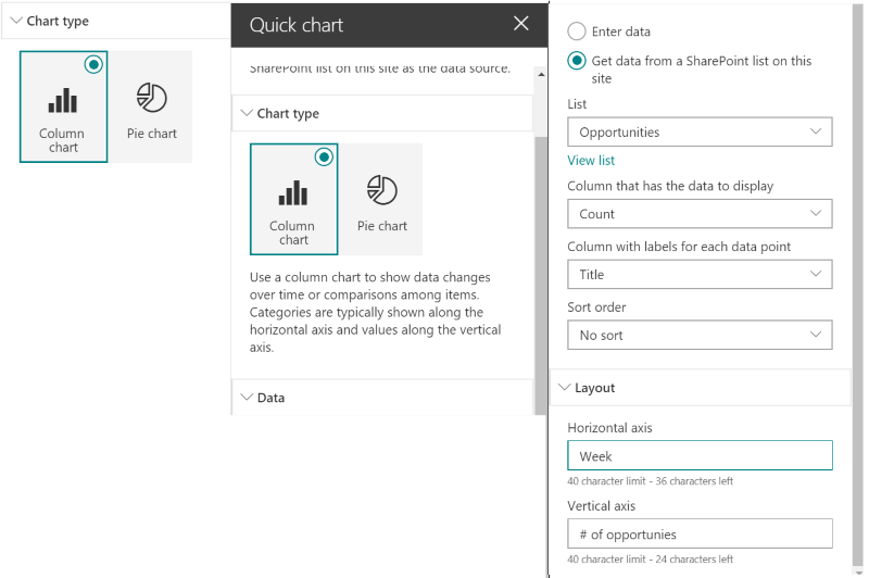
Configuration of the web part is simple, you can enter data manually or connect to a list on SharePoint. When connecting to a list, first list is selected. Currently lists on current site are supported and lists with supported column types are only visible. Supported column type for data labels is Text and for data columns Number and Currency. After list selection, data and label columns are selected. Sorting can be based on data or label column. Labels for axis can be added, if required.
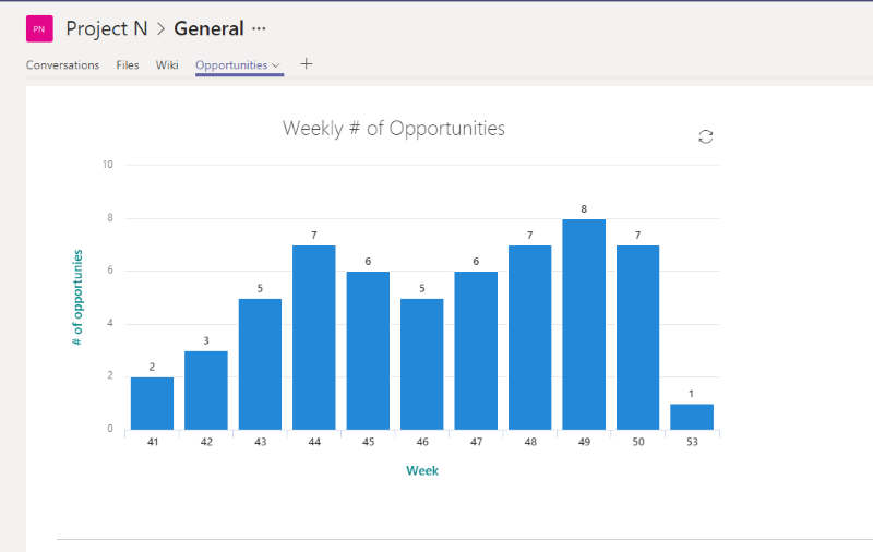
Now let’s add some data to the list and see the chart.
Okay, data is on a list on SharePoint, what can we do to make it better? Let’s add a Flow to update the list automatically from a back-end system.
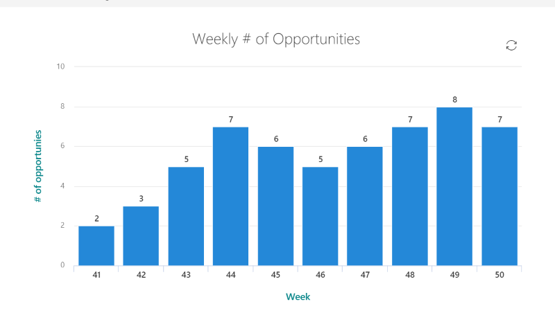
Example – display weekly count new opportunities
This is a very simple example for displaying weekly count of opportunities created to Dynamics 365. Weekly count is updated, when new opportunity is added.
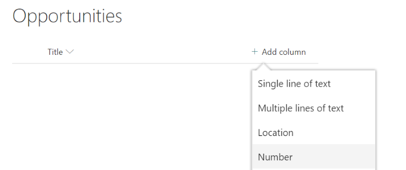
Create a list for data on SharePoint
Just Add an App to a SharePoint site, pick Custom list as template and give “Opportunities” as list name. Add new Number typed column, named Count.
For this example list’s Title column is used as week number, and column can be renamed to Week, if needed. Add Quick chart web part to a page and configure it to display data from Opportunities list.
Create update Flow
Update Flow is triggered, when new opportunity is created to Dynamics 365. Flow will increase the case count on current week to SharePoint list.
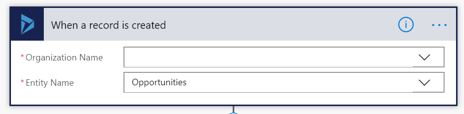
Step 1. Create Dynamics 365 trigger for opportunities
Step 2. Calculate week number
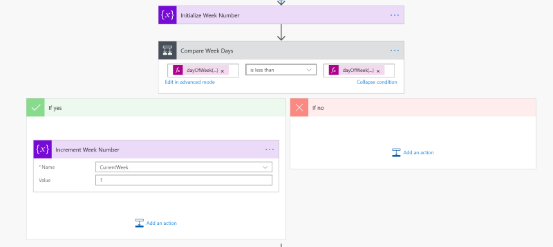
At first week number is initialized with an expression:
add(div(dayOfYear(utcNow()),7),1)
Then day of week is compared between current date and January 1st on current year.
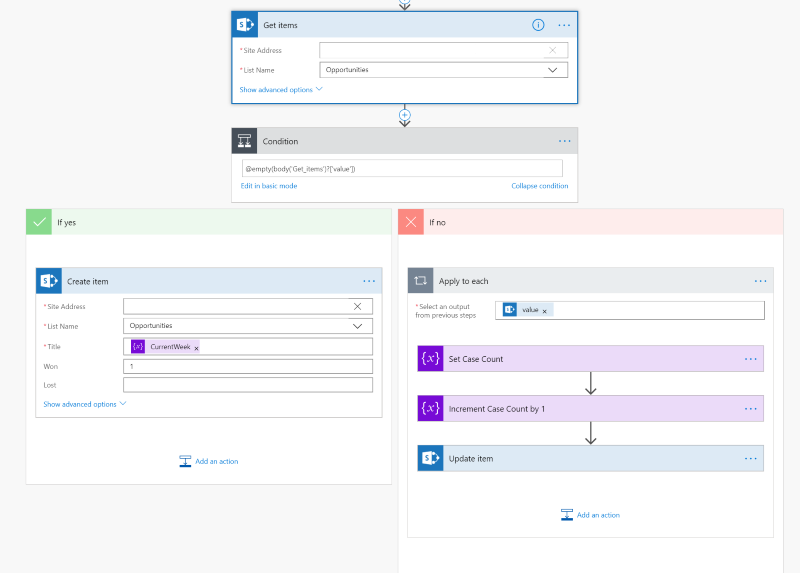
Step 3. Create new list item or update available list item
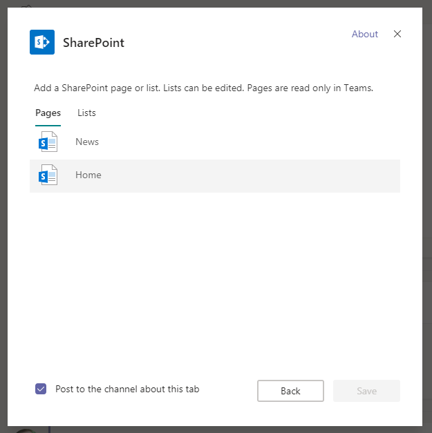
Bonus: Add it to Teams tab
Quick chart can be added as a Teams tab just by adding a SharePoint tab and connect to a page, where quick chart is configured. If page is not on team’s team site, just Website tab can be used.
Afterword
Even though Quick chart web part is simple and currently have only two different chart types available, it is still very useful feature to display simple data to end-users. There is lot of use cases, where this might come handy
- factory safety incidents on intranet front page
- weekly access to treatment queue situation
- number of open service requests
- you name it
Microsoft Flow can be used for collecting and updating data from SharePoint or an external data source and create dynamic charts for end-users.
Discover more from Enabling the Future of Work with Matti
Subscribe to get the latest posts sent to your email.

This is a fantastic site, could you be interested in doing an interview regarding how you developed it? If so e-mail me!
LikeLike