Flexible Page Sections on SharePoint article and news pages are now available for targeted release users and soon be available for everyone (current estimate March-April 2025). Flexible sections are one of the biggest updates for pages authoring offering flexible capabilities for content authors creating more beautiful, functional, and engaging pages and news.
Creating and controlling a flexible section
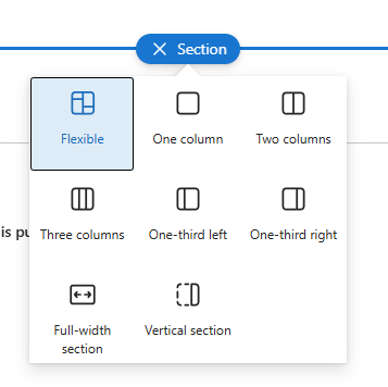
Flexible sections are created like any other section. Simply click the new section icon and selecting Flexible option on the page canvas. Flexible sections also work alongside vertical sections. Flexible sections can be transformed to column-based sections, but column-based sections cannot be transformed as flexible. Each page can have multiple flexible sections, if needed.
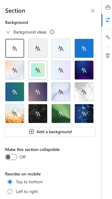
Flexible section has the same background settings as other section options, and it’s a good idea to include a background to a flexible section to make it even more compelling. The flexible section can also be a collapsible section. The “Reorder on mobile” setting controls how section content is arranged on mobile devices. It’s good idea to periodically check the section alignment on mobile devices using browser developer tools.
You can duplicate and rearrange the flexible section by dragging it. Adjust the section’s height from the bottom-right corner. The set height is visible on desktop layouts.
Creating content with a flexible section
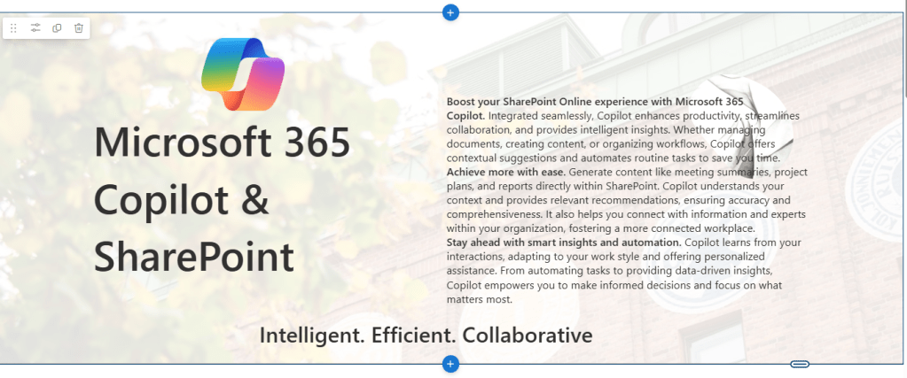
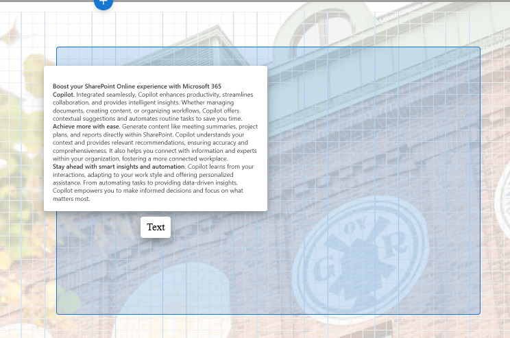
Flexible sections offer a grid layout where web parts can be moved, resized, overlapped and grouped freely. Unlike other section types, web parts are added only from the right-hand side toolbox. All out-of-the-box web parts are available and flexible sections support web parts created using SharePoint Framework (SPFx). All web parts supports resizing within the flexible section, but on some web parts size depends on web part’s layouts. For example News web parts aligns with layouts available or resizing of an image web part depends on the aspect ratio of the image.

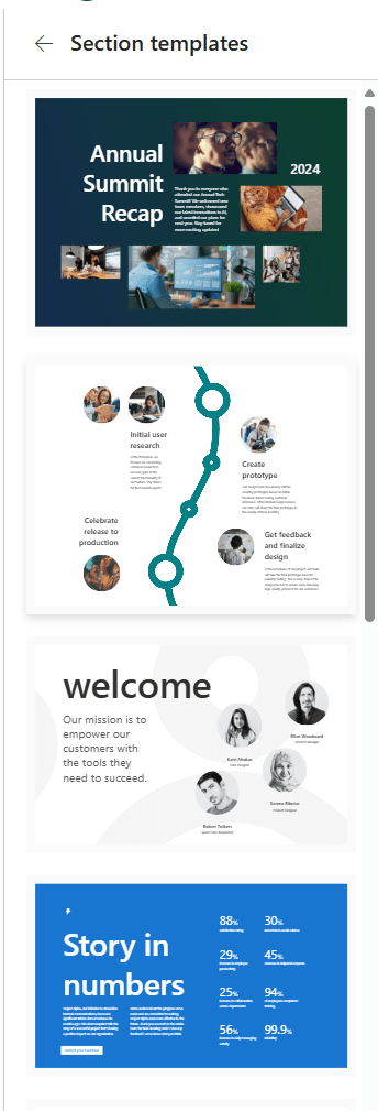
Stock images can be added easily from the tool box to the section. If you’re out of ideas, you can use section templates found at the bottom of the toolbox.
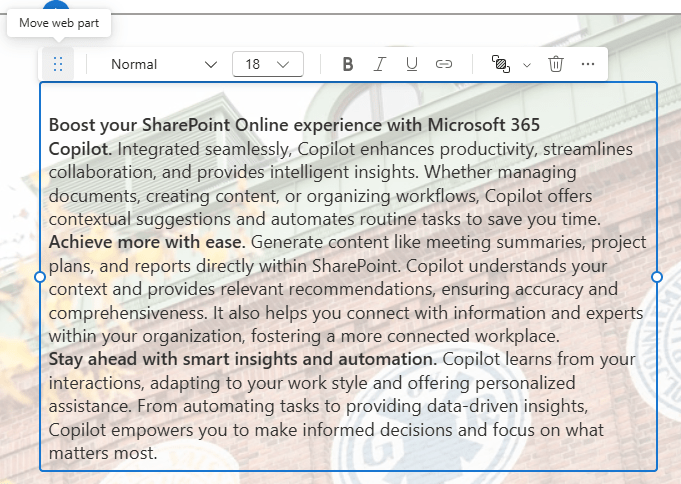
Re-arranging web parts within a section can be done simply by selecting the web part and selecting Move web part from the web part’s toolpane. When moving, you can see how it aligns in the grid.
Top tip: don’t try to move an image by dragging it directly.
Overlapping of web parts and web part groups can be easily controlled by arranging items settings.
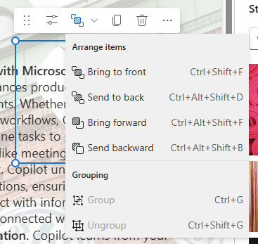
You can group two or more web parts together, then move the entire group or adjust their overlapping. Web parts are picked for grouping by holding Ctrl-button and selecting. Grouping option appear on the top-left corner of the grouped web part outline.

Ideas for using flexible sections
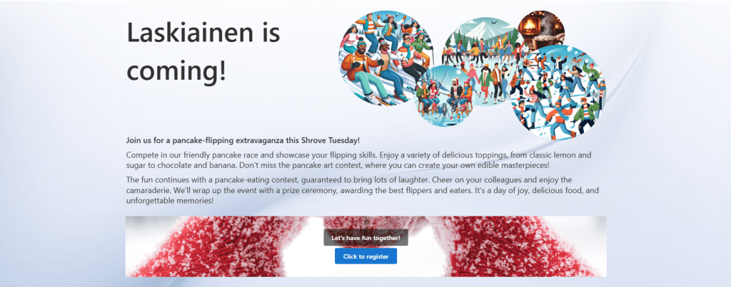
Flexible sections are ideal for a more visual approach, such as marketing an internal company event, highlighting successes and results, creating engaging landing pages, or marketing company products internally. Why not build a company intranet front page with flexible sections?. The whole content of the page can be just a one flexible section, even without a page header, which nowadays can be removed as well.

Use different text layouts, styles and sizes. Add logos and images, overlapping and using image shapes will give a nice touch for decorative images. Remember to check the page layout on mobile devices and observe how it behaves with different reorder options. Try it, learn it and have fun creating nice pages.
Flexible sections are also supported on page templates, which can utilized to create beautiful company-level pages or news articles.
Discover more from Enabling the Future of Work with Matti
Subscribe to get the latest posts sent to your email.
 Enabling the Future of Work with Matti